
QLD Government - Breast Screen Queensland
Figma - Design, Usability Testing
5/10/202110 min read
What Is BSQ? - Breasts Screen Queensland
BreastScreen Queensland provides free breast cancer screening for all eligible Queensland women.
Women aged from 50 to 74 years are particularly encouraged to visit a BreastScreen Queensland Service every two years, as increasing age is the biggest risk factor in developing breast cancer. Women from the age of 40 and those choosing to continue screening after 75 are also eligible to attend for a breastscreen.
BreastScreen is the only BreastScreen Australia accredited breast cancer screening provider in CQ offering free screening and assessment, to eligible women, using digital mammography technology.
Why Redesign the Website?
The purpose of redesigning this website was to provide consistency across Queensland Governemnt Websites which will improve the online experience for citizens by:
providing an immediate sense of trust that the citizen is on a Queensland Government website
ensuring citizens need only learn once how to:
- orient themselves and navigate within a website
- interact with forms and common interface components
- providing a universal approach to issues of social inclusion, including:
- use of plain English
- browser support
- promotion of open standards and formats
- accessibility
Usability testing on Queensland Government websites has demonstrated that the Consistent User Experience Standard has achieved success. Testing has found that users like that Queensland Government websites look similar, and that they can easily identify that they are on a Government website. This ease of identification increased the trust and confidence users felt when interacting with the websites.
Risks of Non-Conformance
Failure to conform to these requirements will degrade the user experience resulting in user distrust, dissatisfaction, and channel abandonment. User abandonment will result in increased costs for service provision as these users will need to be serviced via more expensive channels (e.g. phone or counter).
We were particularly focusing on enhancing booking part of the system as it did not match conformance criteria of CUE template classified into three categories: Mandatory, Desirable and Optional.
The Project Goals and Motivations
The new UI must provide the same functionality as the existing BSQ UI.
The look and feel of the site, such as color schemes, must remain as they are or allowed to be just slightly different.
The new BSQ UI must follow the same flow as the existing BSQ UI e.g. Login
home page is the account overview
steps to register are the same order
steps to create/change/cancel an appointment are the same order
We do not want to force re-training of people who are already familiar with the UI.
Reduce the number of pages reloads and jumping of the existing BSQ UI.
Increase the CUE and WCAG compliance where possible as long as we are not drastically changing the site.
Identify value add and make the site a worthwhile upgrade. e.g. BSQ already has a functioning site, why should they bother to switch over to the new version.
The Design Process
🎭 01 EMPATHIZE
📖 02 DEFINE
✍ 03 IDEATE
📜 04 PROTOTYPE
🎉 05 TESTING
🎭 01 EMPATHIZE - UNDERSTANDING THE USER
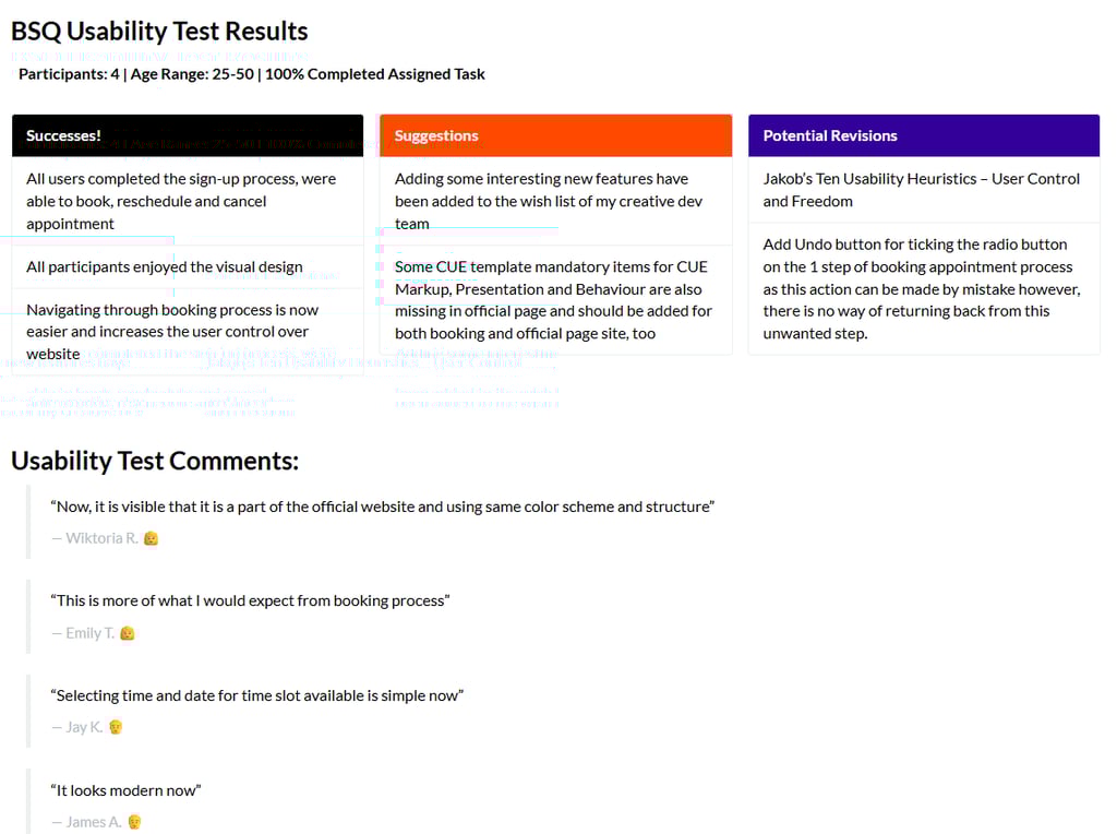
I conducted a usability test with 4 users aged 25-50 years old. Participants were asked to book an appointment in one of the Queensland facilities. From there, participants were encouraged to express their feelings on what they liked, disliked or can be improved as they browsed the site.
Navigation and overall UI are confusing — Participants were disappointed by the user interface and stated that the navigation process was more complicated than expected.
More standardized Queensland Government page — Participants expected more recognization of Governemnt page, providing immediate sense of trust
Users wanted to find a way how to navigate throught sites and processes more easily — Participants expressed interest in a more navigating experience.
Users wanted more control over huge amount of the input fields — Participants expressed a desire to have the ability over sections with collapsible and expandable accordions
Usability Test Comments:
“How can I undo my changes or return back to the previous step in the booking process? There is no back button or indication on how this could be performed”
Wiktoria R. 👩
“How could I go from 0% to 25% in booking confirmation process from Step 1 to Step 2? It is confusing!”
Emily T. 👩
“Why time slots have so many different colors? Which one is available and which one is booked?”
Jay K. 👨
“Web looks depreciated”
James A. 👨
Heuristic Evaluation
After completing the usability test, to get deeper understanding of the problem was to make a heuristic evaluation, to inspect and identify problems in user interface. To pinpoint the booking pain points I used Consistent User Experience template, Gestalt Principles and Jakob Nielson’s 10 Usability Heuristics in providing a better design solution.
📖 02 DEFINE - RESEARCH SYNTHESIS
After gaining some clarity on the user’s needs and my dev team’s suggestions I began with my research synthesis. As per time limitation, I have not developed any empathy map, user personas etc. but used my experience from the research I conducted with participants with disability working on some previous projects for Queensland Health, thus I created a feature roadmap only to speed up the process of testing.
Feature Roadmap
In this stage I have created a list of the features with the high importance that had to be prioritized. I have not done any complex competitive analysis just took and inspiration from some booking-related sites and prototypes following the best practices.
Breadcrumbs - CUE Markup - CRITICAL FUNCTION
Assistive technology - CUE Behaviour - adding ARIA landmarks - CRITICAL FUNCTION
Visual Hierarchy - CUE Presentation - Gestalt Principles - CRITICAL FUNCTION
Risks of non-conformance - CRITICAL FUNCTION
✍ 03 IDEATE & 📜 04 PROTOTYPING - PUTTING A PLAN TOGETHER
Normally, I would start with a new flow of Information Architecture however, as we were not allowed to make any drastic changes to the booking system, I decided to skip this part and moved quickly to prototyping.
UI KIT
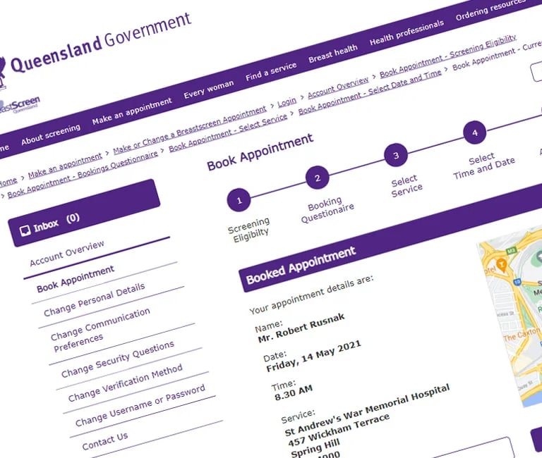
I used branding colors and typeface of the Breast Screen official website for redesigning booking system to be enhanced and made it consistent.
High-Fidelity Prototyping
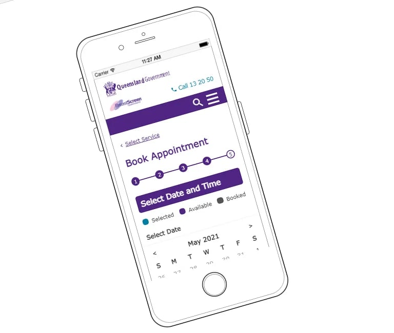
I had only 5 business days for providing a final redesigned version for large devices and completely created a mobile version from scratch so I simply skipped wireframing and low-fidelity prototyping and moved into high-fidelity prototyping as we exactly knew what we wanted to change and how to meet our requirements in order to increase CUE conformance level. I had began finalizing my thoughts by creating prototypes of each screen in two different adaptive views.
🎉 05 USABILITY TEST
After a few days of prototyping, I again tested the same participants (members of my team) with the enhanced version of the Brest Screen booking system and they really enjoyed it.
The Usability Test Was a Success!
All participants were able to make the appointment easier and faster than using old system. Some design changes could be addressed if we are allowed to perform the bigger changes to the website breaking the current flow of the performing the booking.
We Are Finally Done!
Overall, this redesign experience has been really eye-opening for me.
It was a daunting project that came with its own set of complex challenges, limitations and lots of learning. If I had more time, I would definitely have loved to gather more feedback from real audience related to the purpose of the page as Breast Screen is mostly female related website.
Project was built quickly as a proposal only so not appropriate participants only the members of my developer’s team have been tested.
Thanks so much for reading! If you enjoyed this case study and would like to share any creative suggestion and ideas hit me up 🙏
CUE Cheatsheet 🎖️
The fastest way to give you all the necessary information with a conformance level.
Agencies that do not wish to use the CUE template must still follow the template conformance requirements for markup, presentation, and behaviour.
Compliance and Exceptions
The Consistent User Experience Standard is mandated through Websites policy (IS26).
Should an agency identify a need to apply for an exception to any mandatory requirement of the CUE Standard, they must follow the Queensland Government Enterprise Architecture exception process. Websites policy (IS26).
Best Practices to Enhance and Follow:
Header, Top Navigation Menu (Qld logo, site page, utility bar with search input field) - Department of Transport and Main Roads, Queensland Legislation, Business Queensland
Top Horizontal Menu with sub-menu items for phones and small devices - Department of Agriculture and Fisheries
What Is BSQ? - Breasts Screen Queensland
BreastScreen Queensland provides free breast cancer screening for all eligible Queensland women.
Women aged from 50 to 74 years are particularly encouraged to visit a BreastScreen Queensland Service every two years, as increasing age is the biggest risk factor in developing breast cancer. Women from the age of 40 and those choosing to continue screening after 75 are also eligible to attend for a breastscreen.
BreastScreen is the only BreastScreen Australia accredited breast cancer screening provider in CQ offering free screening and assessment, to eligible women, using digital mammography technology.
Why Redesign the Website?
The purpose of redesigning this website was to provide consistency across Queensland Governemnt Websites which will improve the online experience for citizens by:
providing an immediate sense of trust that the citizen is on a Queensland Government website
ensuring citizens need only learn once how to:
- orient themselves and navigate within a website
- interact with forms and common interface components
- providing a universal approach to issues of social inclusion, including:
- use of plain English
- browser support
- promotion of open standards and formats
- accessibility
Usability testing on Queensland Government websites has demonstrated that the Consistent User Experience Standard has achieved success. Testing has found that users like that Queensland Government websites look similar, and that they can easily identify that they are on a Government website. This ease of identification increased the trust and confidence users felt when interacting with the websites.
Risks of Non-Conformance
Failure to conform to these requirements will degrade the user experience resulting in user distrust, dissatisfaction, and channel abandonment. User abandonment will result in increased costs for service provision as these users will need to be serviced via more expensive channels (e.g. phone or counter).
We were particularly focusing on enhancing booking part of the system as it did not match conformance criteria of CUE template classified into three categories: Mandatory, Desirable and Optional.
The Project Goals and Motivations
The new UI must provide the same functionality as the existing BSQ UI.
The look and feel of the site, such as color schemes, must remain as they are or allowed to be just slightly different.
The new BSQ UI must follow the same flow as the existing BSQ UI e.g. Login
home page is the account overview
steps to register are the same order
steps to create/change/cancel an appointment are the same order
We do not want to force re-training of people who are already familiar with the UI.
Reduce the number of pages reloads and jumping of the existing BSQ UI.
Increase the CUE and WCAG compliance where possible as long as we are not drastically changing the site.
Identify value add and make the site a worthwhile upgrade. e.g. BSQ already has a functioning site, why should they bother to switch over to the new version.
The Design Process
🎭 01 EMPATHIZE
📖 02 DEFINE
✍ 03 IDEATE
📜 04 PROTOTYPE
🎉 05 TESTING
🎭 01 EMPATHIZE - UNDERSTANDING THE USER
I conducted a usability test with 4 users aged 25-50 years old. Participants were asked to book an appointment in one of the Queensland facilities. From there, participants were encouraged to express their feelings on what they liked, disliked or can be improved as they browsed the site.
Navigation and overall UI are confusing — Participants were disappointed by the user interface and stated that the navigation process was more complicated than expected.
More standardized Queensland Government page — Participants expected more recognization of Governemnt page, providing immediate sense of trust
Users wanted to find a way how to navigate throught sites and processes more easily — Participants expressed interest in a more navigating experience.
Users wanted more control over huge amount of the input fields — Participants expressed a desire to have the ability over sections with collapsible and expandable accordions
Usability Test Comments:
“How can I undo my changes or return back to the previous step in the booking process? There is no back button or indication on how this could be performed”
Wiktoria R. 👩
“How could I go from 0% to 25% in booking confirmation process from Step 1 to Step 2? It is confusing!”
Emily T. 👩
“Why time slots have so many different colors? Which one is available and which one is booked?”
Jay K. 👨
“Web looks depreciated”
James A. 👨
Heuristic Evaluation
After completing the usability test, to get deeper understanding of the problem was to make a heuristic evaluation, to inspect and identify problems in user interface. To pinpoint the booking pain points I used Consistent User Experience template, Gestalt Principles and Jakob Nielson’s 10 Usability Heuristics in providing a better design solution.
📖 02 DEFINE - RESEARCH SYNTHESIS
After gaining some clarity on the user’s needs and my dev team’s suggestions I began with my research synthesis. As per time limitation, I have not developed any empathy map, user personas etc. but used my experience from the research I conducted with participants with disability working on some previous projects for Queensland Health, thus I created a feature roadmap only to speed up the process of testing.
Feature Roadmap
In this stage I have created a list of the features with the high importance that had to be prioritized. I have not done any complex competitive analysis just took and inspiration from some booking-related sites and prototypes following the best practices.
Breadcrumbs - CUE Markup - CRITICAL FUNCTION
Assistive technology - CUE Behaviour - adding ARIA landmarks - CRITICAL FUNCTION
Visual Hierarchy - CUE Presentation - Gestalt Principles - CRITICAL FUNCTION
Risks of non-conformance - CRITICAL FUNCTION
✍ 03 IDEATE & 📜 04 PROTOTYPING - PUTTING A PLAN TOGETHER
Normally, I would start with a new flow of Information Architecture however, as we were not allowed to make any drastic changes to the booking system, I decided to skip this part and moved quickly to prototyping.
UI KIT
I used branding colors and typeface of the Breast Screen official website for redesigning booking system to be enhanced and made it consistent.
High-Fidelity Prototyping
I had only 5 business days for providing a final redesigned version for large devices and completely created a mobile version from scratch so I simply skipped wireframing and low-fidelity prototyping and moved into high-fidelity prototyping as we exactly knew what we wanted to change and how to meet our requirements in order to increase CUE conformance level. I had began finalizing my thoughts by creating prototypes of each screen in two different adaptive views.
🎉 05 USABILITY TEST
After a few days of prototyping, I again tested the same participants (members of my team) with the enhanced version of the Brest Screen booking system and they really enjoyed it.
The Usability Test Was a Success!
All participants were able to make the appointment easier and faster than using old system. Some design changes could be addressed if we are allowed to perform the bigger changes to the website breaking the current flow of the performing the booking.
We Are Finally Done!
Overall, this redesign experience has been really eye-opening for me.
It was a daunting project that came with its own set of complex challenges, limitations and lots of learning. If I had more time, I would definitely have loved to gather more feedback from real audience related to the purpose of the page as Breast Screen is mostly female related website.
Project was built quickly as a proposal only so not appropriate participants only the members of my developer’s team have been tested.
Thanks so much for reading! If you enjoyed this case study and would like to share any creative suggestion and ideas hit me up 🙏
CUE Cheatsheet 🎖️
The fastest way to give you all the necessary information with a conformance level.
Agencies that do not wish to use the CUE template must still follow the template conformance requirements for markup, presentation, and behaviour.
Compliance and Exceptions
The Consistent User Experience Standard is mandated through Websites policy (IS26).
Should an agency identify a need to apply for an exception to any mandatory requirement of the CUE Standard, they must follow the Queensland Government Enterprise Architecture exception process. Websites policy (IS26).
Best Practices to Enhance and Follow:
Header, Top Navigation Menu (Qld logo, site page, utility bar with search input field) - Department of Transport and Main Roads, Queensland Legislation, Business Queensland
Top Horizontal Menu with sub-menu items for phones and small devices - Department of Agriculture and Fisheries
Media
©2014-2026 Robert Rusnak | Iteration 5
Contact
AU + 61 432 513 403
Motto
“Fortune favours the bold.”